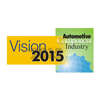
Let's talk Contact us. No cost. No obligation.

Fill out this form and we will contact you with in 24 hrs.

    captcha


    Graphic Design

    Client Type: Direct
    URL: -
    About : Logo design for Automotive Component Industry had to be bold, with elements of automation industry intact. As desired the logo designed was kept colorful to add to its boldness and some elements of graphics were used to give an industrial feel.
    Client Type: Direct
    URL: -
    About : ATM is an Apollo Pharmacy initiative. The logo has been carefully designed keeping elements of a medicine shop intact. The clock on the top of the logo depicts availability round the clock and gels it well with the name - Any Time Medicine.
    Client Type: Direct
    URL: -
    About : Turning vision into reality Acma chose Profit By Outsourcing to develop its logo and brand styling. The design is straightforward with the focus on the word reality. Simple yet elegant the logo effectively drives home the point and conveys the message effectively.
    Client Type: Partner
    URL: -
    About : Logo design for G & L Electronics is designed to help upscale their brand as electrical contractors. The logo style is embedded in technology and has a stylish yet simplistic touch of modernity.
    Client Type: Partner
    URL: --
    About : Logo design for G & L Electronics is designed to help upscale their brand as electrical contractors. The logo style is embedded in technology and has a stylish yet simplistic touch of modernity.
    Client Type: Partner
    About : Working for social and economic justice Next Step's logo was designed keeping the theme in mind. Working closely with the theme, we created a logo which was true to their vision. The concept is based on reducing social and economic disparity making it more egalitarian and just.
    Client Type: Partner
    About : US Consumer Protection strengthens the consumers buying power enabling them to make informed choices. For UCPS a professional style clean and uncluttered brochure was produced. The brochure was rich in information,easy to read and appealing. Using red blue and beige as the main colors it was kept simple yet stylish and to the point.