Let's talk Contact us. No cost. No obligation.

Fill out this form and we will contact you with in 24 hrs.

    captcha


    Graphic Design

    Client Type: Direct
    URL: -
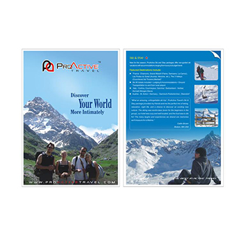
    About : The brochure for Pro Active Travels which is primarily an adventure company. Using a whole lot of photographic images we designed an adrenalin thumping, robust and a confident brochure. Keeping it informative colors depicting nature such as blue and white were used amply. It was important to keep it visually attractive so that appealing in form it would lead readers turn into travelers.
    Client Type: Direct
    URL: -
    About : The brochure design for Origin had to synchronize well with its brand name and style. The idea of the fruit being natural and fresh was apt for the cover page. The brochure being rich in content used photographic images to illustrate it.
    Client Type: Direct
    URL: -
    About : The brochure design for Observer Research Foundation was kept sparse with white as background representing it to be all pervasive. The use of a pencil depicting knowledge merges well with the foundation's logo just as the invisible merges seamlessly with the visible. Minimal use of photographs or any kind of imagery gives the brochure a non- cluttered, intellectual air.
    Client Type: Direct
    URL: -
    About : The brochure design for Infrastructure show had to be very flashy, yet friendly, modern, yet attractive to a wide audience. The brochure was rich in content and used photographic images and modern topography to present a fresh and an ultra modern look.
    Client Type: Direct
    URL: -
    About : The product catalog for India Home Fashions used good quality images and earthy, natural colors to reflect the beauty of the Indian homes. The brochure was kept simple yet classy and sophisticated. Earthy tones used throughout the brochure gave it a sense of warmth and cosiness.
    Client Type: Direct
    URL: -
    About : Brochure design for telecom giant Idea. The design enables the information within the brochure to be viewed and read with ease. The colors yellow and blue were primarily used as part of their brand identity. Thematic in nature it used photographic images of different countries to present its various offers as a passport to exciting privileges.
    Client Type: Direct
    URL: -
    About : Hyundai Tucson's Brochure was kept in sync with the brand image. All about accessories the idea was to make it rich in information keeping quality and professionalism intact. We developed a simple, well defined brochure with photographic image to portray this effect.
    Client Type: Direct
    URL: -
    About : The brochure designed for Hyundai Getz was kept simple and informative using photographic image of the car set against a moving background. The cover page instantly reflects the feel of speed and the need to go ahead. It depicts a brand image in style, giving it a razor's edge.
    Client Type: Direct
    URL: -
    About : Hyundai commissioned us to come up with a slick and professional brochure for their high end car Atlanta. The brochure designed was hard hitting creating an instant impact with its modern look and feel. Keeping it restricted to tones of blue and black, modern topography and bold letters were used to portray this effect.
    Client Type: Direct
    URL: -
    About : Artd'inox means 'the art of stainless steel'. The brochure for the delightful creations molded out of raw steel had to be a fine embodiment of art and science designed to enhance the brand image. Contemporary, stylish and chic it merged seamlessly with the well-defined edges and the smooth sensuous surfaces of artd'inox. The layout of the brochure was purposely kept sparse to give it a non cluttered and clean look.